Here is an article I read in today's Jerusalem Report:
Everyone and his Struwwelpeter
Tuesday, December 30, 2008
Saturday, November 22, 2008
Another 2 Chapters
Die Geschichte Vom Daumenlutscher
It has been years since I have sucked my thumb. I wonder what the draw was. What about my thumb was so appealing I would push away fears of a tailor with giant scissors just to suck it? More importantly, why do I have the sudden urge to do it now?


Die Geschichte Vom Hanns Guck-In-Die-Luft
The sky was so blue. The clouds were so white and puffy. It looked like a painting. SPLASH!


Friday, November 21, 2008
Story Preview
Here is a preview of a story with full text and images:
Die Gar Traurige Geschichte Mit Dem Feuerzeug
I have always been fascinated with fire. It has such an ephemeral beauty. I know it can be dangerous, but still… As I drift off to sleep watching the candle it feels as if my toes are on fire…


Die Gar Traurige Geschichte Mit Dem Feuerzeug
I have always been fascinated with fire. It has such an ephemeral beauty. I know it can be dangerous, but still… As I drift off to sleep watching the candle it feels as if my toes are on fire…


Thursday, November 20, 2008
even more progress


As you can see my photography is getting more gory- it's the story it's not me. Plus I have "finished" with the writing. Finished is italicized because I am not sure if I really like how it is written. I also took out one story which I may or may not add back in (actually I took out two but one I know I am not adding in.) I am also not sure how I like the picture with the flames. It is hard to make flames look good not in color. (They are real flames by the way...)
• Intro
I recently found the book in a box in the attic. I never believed its stories, not really, a nightmare here and there. Nothing a child with a rebellious spirit couldn’t handle. I mean after 22 years I still have my thumbs right? I think I will read it for old times sake…
• The Story of Slovenly Peter
After ten hours at school, a class at the gym and six hours at the computer doing homework I am dead tired. Washing up is over rated. I will brush my teeth tomorrow…
As I drift off to sleep I start to have the weirdest dream. My hair gets matted, my face covered in soot, I am all alone and searching for food in a garbage can. Why does this seem familiar?
• The Story of Pauline and the Matches
I have always been fascinated with fire. It has such an ephemeral beauty. I know it can be dangerous, but still… As I drift off to sleep watching the candle it feels as if my toes are on fire…
• The Story of the Inky Boys
I pride myself on not being racist, but tonight in that back ally I couldn’t help but be nervous when I saw those guys. I suppose spilling my ink over all my work and staining my hands had nothing to do with what happened, but it almost seems like too much of a coincidence.
• The Story of Little Suck-a-Thumb
It has been years since I have sucked my thumb. I wonder what the draw was. What about my thumb was so appealing I would push away fears of a tailor with giant scissors just to suck it? More importantly, why do I have the sudden urge to do it now?
• The Story of Augustus who not have any Soup
I love to eat. You would never guess because of my size, but it’s true. Today though, there was nothing appealing about the soup my mother put down in front of me. Then I remembered it was the same soup we had yesterday. I wonder how long this is going to go on for?
• The Story of Fidgety Philip
I can’t sit still. Never could. At the dinner table my mother told me if I don’t stop fidgeting I would fall and pull the whole table down with me. She hasn’t told me that in years…
• The Story of Johnny Look-in-the-Air
The sky was so blue. The clouds were so white and puffy. It looked like a painting. SPLASH!
• The Story of Flying Robert
We have this huge umbrella just sitting in the closet. It was raining outside. Not too much mind you, but the umbrella was there. The heavy wind started to drag me forward… suddenly I was flying. Is this just a dream as well?
• Conclusion
Reality and fantasy seem to have gotten a bit twisted in my mind. The book has such a history it isn’t too hard to imagine it taking over some deep recess of my brain. I just wish I knew what was real and what was false.
Wednesday, November 19, 2008
progress
It is really hard to be productive with this strike going on. I do not work well unless under pressure. That being said things are moving- even if they are moving a bit slowly. Half my photos are done (and by done I am mean sized and saved in the proper file format- done) and the others will hopefully be done soon. I decided I want my book to be smaller than I initially thought- I can't decided whether it should be 5X5 inches or 6X6 inches... I have done some writing, but that still needs a lot more work. Here is an excerpt:
• Intro
I recently found the book in a box in the attic. I never believed its stories, not really, a nightmare here and there. Nothing a child with a rebellious spirit couldn’t handle. I mean after 22 years I still have my thumbs right? I think I will read it for old times sake…
• The Story of Slovenly Peter
After ten hours at school, a class at the gym and six hours at the computer doing homework I am dead tired. Washing up is over rated. I will brush my teeth tomorrow…
As I drift off to sleep I start to have the weirdest dream. My hair gets matted, my face covered in soot, I am all alone and searching for food in a garbage can. Why does this seem familiar?
I am not sure what I think about the writing though...
In addition I got Fraktur mon Amour and it has gotten me thinking a lot about what I want to do with the type. It is actually opening me up to the idea of using blackletter as text type. It is surprisingly readable. By that I mean it isn't much harder to read at small sizes than it is at large sizes- but once I have all my material together I will make that decision.
Sunday, November 2, 2008
Busy Busy Busy...
After compiling a collection of photography using myself as a model, some thinking and an in-class critique my book is going to become a story within a story where these cautionary tales start to take over my life or dreams or something- not sure how I am going to work things out because there are only so many times a person can die. Hopefully I will start to write my story today- which will be in English (maybe with a few German expressions). I have also been working a lot on the photography (some more photos below). I have decided to take a break for a bit on the layout to get the story down and also to await for the arrival of Fraktur Mon Amour as it not only should give me some insight into working with Blackletter in a modern context, but it comes with a CD of over 100 fonts which may allow me to push the typography further. It could also confuse me...


Wednesday, October 29, 2008
Type Samples
Third post today! Things are finally moving. Question for everyone and anyone out there in blogger land. Which of these six fonts do you like the best? Also keep in mind the style of photography which you can see on the previous post... Also, keep in mind the type and photos will not be one the same page so they won't be competing to much (if you look even further back you will see some extremely rough sample spreads to get an idea of how the layout will be). The photos will also be slightly more abstracted and cropped and possibly higher contrast as well. If you have the name of a great Blackletter I haven't tried (I used what I had) please pass it on.


SEPIA!
Here is a sample of some of my edited photos. I decided to go with sepia in the end rather than black and white or blue. This is primarily because I just love how the photos look in sepia- it adds this amazing creepiness. As sepia tends to age the look of things it is an interesting contrast to the modern subject matter and layout.


Progress- or so I think...
My house smells like smoke, my camera is on the verge of death, my face is covered with ashes, my hair is a mess, my hands may be frost bitten, there is a destroyed table cloth in the trash and my tripod is fully expanded. Finally, I am getting somewhere!
I decided I want to be both the photographer and model for all my images. Admittedly it does make the job a lot harder in some ways, but easier in others. Plus I enjoy working like that. I did manage to get photographs done for a large part of the stories. I will upload and start editing them later today. I would like to have a nice selection done for class on Friday. Now it's probably a good idea to wash these ashes off my face!
I decided I want to be both the photographer and model for all my images. Admittedly it does make the job a lot harder in some ways, but easier in others. Plus I enjoy working like that. I did manage to get photographs done for a large part of the stories. I will upload and start editing them later today. I would like to have a nice selection done for class on Friday. Now it's probably a good idea to wash these ashes off my face!
Monday, October 27, 2008
Checking In
While I finally got my experimental book together I am uber behind in my term project. I think I have some sort of fear of just getting started. I know once I start doing the photography things will come together I just have to do it!
Saturday, October 18, 2008
Problem Solved
I have solved my monotone and duotone problem. Rather than use photoshops mono or duotone setting, if I desaturate and the adjust the hue and intensity of the image I can get really crisp single color images.
Thursday, October 16, 2008
Experimentation
I decided to experiment with color a bit rather than just go with black, white and red which was my initial instinct. I also experimented a bit with the title page. One of my big concerns, is that it is hard to get really crisp looking mono and duotone images. For some reason the colors of the spreads look really bright on the blog, while in fact they are a bit darker and subdued. The color palate though not identical, was inspired by the Nightwish website.


 I am also playing around with the idea of a rectangle format vs the square. Maybe use the dimensions and binding techniques of the original book.


 I am also playing around with the idea of a rectangle format vs the square. Maybe use the dimensions and binding techniques of the original book.
Wednesday, October 15, 2008
Manuscript 2.0
Here is the basic break down by page of my book as it stands now:
1. 1/2 title
2.
3. full title
4. table of contents
5. table of contents
6. The Story of Slovenly Peter- title
7. The Story of Slovenly Peter- peter sitting alone in corner
8. The Story of Cruel Frederick- title
9. The Story of Cruel Frederick- animal cruelty
10. The Story of Cruel Frederick- bite marks
11. The Story of Pauline and the Matches- title
12. The Story of Pauline and the Matches- lighting match
13. The Story of Pauline and the Matches- burning
14. The Story of Pauline and the Matches- ashes
15. The Story of the Inky Boys- title
16. The Story of the Inky Boys- mocking black kid
17. The Story of the Inky Boys- ink spills
18. The Story of Little Suck-a-Thumb- title
19. The Story of Little Suck-a-Thumb- sucking thumb
20. The Story of Little Suck-a-Thumb- tailor with scissors
21. The Story of Little Suck-a-Thumb- bleeding thumb
22. The Story of Augustus who not have any Soup- title
23. The Story of Augustus who not have any Soup- day 1
24. The Story of Augustus who not have any Soup- day 2
25. The Story of Augustus who not have any Soup- grave
26. The Story of Fidgety Philip- title
27. The Story of Fidgety Philip- fidgeting at table
28. The Story of Fidgety Philip- table collapsed
29. The Story of Johnny Look-in-the-Air- title
30. The Story of Johnny Look-in-the-Air- walking with head in the clouds
31. The Story of Johnny Look-in-the-Air- hand sticking out of river
32. The Story of Flying Robert- title
33. The Story of Flying Robert- walking with umbrella
34. The Story of Flying Robert- being blown away
35.
36. imprint (containing basic info on the original author and other info)
I am toying with the option of creating one last story that relates to life as a design student- but I not sure whether I really want to do that. I may not use all the stories from above.
I have decided I want to print the book either a semi-gloss or glossy, but I definitely want it to have a sheen. The book will be square and fairly small. I want to print it on paper that is fairly heavy as I want it to feel as solid as possible and it is pretty short. I still have to decided about the cover and binding.
I do not think the photography will be as abstract as I originally anticipated but it will definitely still leave something to the imagination. I want the style of photography to be fairly consistent as I want it to tell the story. It is going to be black and white.
I think I have decided that the stories will not be narrated and that the photography and titles will carry the stories on their own. The table of contents will have the title of the story in English, while the title page will be in German. I plan to use Blackletter on the title pages and cover, but I think the table of contents, imprint, and half title will be in a sans serif. I may use color sparingly on the pages that contain text.
I am not sure if all pages should contain folios- maybe just title pages. The pages with the photography may just be fully bled photographs... I am just not sure if it will be dynamic enough if most pages are just photographs...
2 sample spreads I did (very quickly) just to get some ideas on screen. I really need to try some more creative stuff with the type.


(the white line going across the bottom of the two spreads should not be there- all images are fully bled)
Wednesday, October 8, 2008
Text
I have been playing around with the wording for my text.
I know I want to keep all titles in the original German. Right now I am trying to use both English and German in the text. One idea is to rewrite the poems in more modern language and switch off between English and German. For example:
Der Struwwelpeter
Long hair and longer nails.
Gesicht schwarz wie die Nacht.
All alone.
Niemand will zu spielen mit Peter.
Another idea would be to have no linear narrative but rather just words in the two languages that are descriptive enough to tell the story without sentence structure.
Sunday, October 5, 2008
Photography
Over the weekend I started to play around with photography a bit. Snapping some pictures; doing some photoshopping. Here is one picture I did for the story about the child who drowns. I still think it looks too photoshopped and I am not sure if I like the black and white contrast the way it is. Either way the process has given me some more ideas for directions. I had this idea to make the pages look like old newspaper clippings. As if these horror stories about what happened to the kids was written in the paper. I also thought of possibly binding the book with nuts and bolts to give it this cold feel. We will see.

I also took a lovely trip to Indigo- I love book shopping!

I also took a lovely trip to Indigo- I love book shopping!
Friday, October 3, 2008
Initial Blue Print for Book
Der Struwwelepeter 2.0, your childhood nightmares revisited
The Book:
Der Struwwelepeter taught generations of children how to behave. It’s nightmarish tales scared but also entertained many children since its creation in 1845. My version is meant for the people who grew up on these stories. At this point I am not sure whether my version is meant to bring back old fears or infuse humor into them. Either way it is going to be a grown up, slightly abstract and fragmented and photographic version of the original.
To do:
• “Write” stories- I want to take the stories and break them up into fragmented bits of English and German. In the original form they are poems, in my book I want them to have a more post-modern feel.
• Take photographs. (Possibly need to find models- human and animal)
• Layout content.
• Put book together.
• Make decisions (see below).
Decisions:
Feeling
• Bringing back old fears
• Bringing humor to old fears
Photography
• All black and white or small elements of color
• Considering that all images are hands with different props and positions
• Purely photographic or the possibility of other graphic imagery
• Level of abstraction
Type
• Sans serif, black letter or combo
• Ex: Struwwelepeter vs Struwwelepeter
Language
• Primarily English or German or equal
Size and Shape
Printing
• Glossy or matte
Binding
• Professionally bound?
• technique
original imagery


Inspirational Imagery


Thursday, October 2, 2008
Change of Pace
Up until now this blog has been primarily about motion graphics. Now it isn't that I don't still love motion graphics- even if I have decided an MFA in film is not longer in the running- but I need a book blog for book design. Rather than create a whole new blog, I am repurposing this one. After all how many design blogs does one girl need?
Monday, September 15, 2008
Type
I would just like to say, that after pretty much every prof I have had since year one has mention Robert Bringhurst's "Elements on Typographic Style" I finally bought, and am reading the book. At this point I haven't read very much and all I have to say about things is that I like the paper choice. It is very smooth. I hope the book is as inspiring as they make it out to be since I could really use some inspiration...
After three years of nothing but graphic design I think I have lost my ability to think in 3D. A slight problem since I am applying to a masters in industrial design. I really must start to get a portfolio together, hence the need to be inspired. I thought I knew what I was doing, but I don't, and I really can't deal with anymore rejection from Bezalel.
After three years of nothing but graphic design I think I have lost my ability to think in 3D. A slight problem since I am applying to a masters in industrial design. I really must start to get a portfolio together, hence the need to be inspired. I thought I knew what I was doing, but I don't, and I really can't deal with anymore rejection from Bezalel.
Thursday, August 28, 2008
hire me!
I am about to start year 4 of York Sheridan design- which is insane!!!!!! and I would really like a part-time job in my field, or a related one... I have some prospects- but I just want things to fall into place already! Either way, I am somewhat excited to start school again. I really do like designing and miss it.
Tuesday, August 19, 2008
After 3.5 months away I am back home and already back designing things. There is never any rest. I am really hoping I manage to redesign my website before school starts- I want something with a gallery that is a lot easier to update- hopefully I will have a lot to update it with.
On another note my dad found this article that discusses the 10 fonts you would bring if you were stuck on a desert island. My two favorite sans serif fonts were on the list: Gill Sans and Helvetica Neue Light. I guess YSDN is doing something right. My dad wanted to know why the newspaper would bother printing an article with such a limited audience. I couldn't answer that. But the article made me happy so that is something I guess.
Also, I just wanted to share a cool video a friend showed me this summer. The videography and cinematography are nothing to write home about. Ok, they are non-existent, but apparently the whole thing was done in one take, no editing and the camera was controlled by one of the guys in the video so that is something. Plus, the concept is amazing and really well executed.
Ok Go "Here it Goes Again"
Thursday, August 14, 2008
Monday, June 30, 2008
Another One Down
Design internship number 3 is officially complete. Almost two months at Render in which I animated a commercial for Amdocs, made a power point template for Oridion, edited a video for Itizu and worked on Render's own soon to be released new website. I worked insane hours, learned a lot and generally had a good time. For a while there I had almost given up the idea of a large agency (the really bad billboards they have in this country were part of that as well), but now that it is all over I am back to thinking that for me at least a bigger company is better.
In other design related news, it turns out one can study design management here in Israel. Bezalel's masters of industrial design program has a design management stream. Here's hoping they won't reject me again, because after visiting their general MFA end of the year exhibit my belief in design's supremacy over art was reaffirmed. It was not a very good exhibit. As it stands Mdes in design management is plan A, film and television (at TAU) is plan B and a job would be plan C. Then again I could always marry rich...
Also, actually I can't think of much else to write. I guess there is only so much to say about my life in regards to design when I am not actually designing anything.
Sunday, May 25, 2008
Waiting for this post to finish Rendering
Ok, so maybe I am not as good a blogger as I thought. I have been working at Render here in Tel Aviv for just over two weeks now. I have improved my photoshop skills by about 100% and animated a commercial for amdocs using my new found After Effects skills. Render is a great place to work- tiny studio made up of three women (Yael, Hofit and Karin) and two dogs (a lab named Uma and a mutt named Loco). Located in the Florentine area of Tel Aviv they moved into this studio about a week before I showed up. As nice as the studio is that is how sketchy the neighborhood is. I am very close to the central bus station and anyone who knows Tel Aviv will know what that means. Render does great work and already in two weeks I have learned so much. One thing I have come to notice though is every studio is only as technologically advanced as the year the principal designers graduated. At 52 Pick-Up they still used Quark, here they like Freehand and Photoshop CS. I wonder if I will be stuck using CS3 forever...?
In other Tel Aviv design news, in my internship application binge I applied to intern at Gitam BBDO (the Tel Aviv branch of BBDO) when I got they had done a massive ad campaign for one of the major banks here in conjunction with Israel's 60th anniversary. It was horrible! I guess being one of the biggest agencys in the world doesn't mean you are the best. Maybe I should rethink my desire to work at a huge agency- maybe it is just that particular one. Maybe, I shouldn't worry about this now and instead find myself a MFA program in this country so I don't have to worry about this for a long time...
In other Tel Aviv design news, in my internship application binge I applied to intern at Gitam BBDO (the Tel Aviv branch of BBDO) when I got they had done a massive ad campaign for one of the major banks here in conjunction with Israel's 60th anniversary. It was horrible! I guess being one of the biggest agencys in the world doesn't mean you are the best. Maybe I should rethink my desire to work at a huge agency- maybe it is just that particular one. Maybe, I shouldn't worry about this now and instead find myself a MFA program in this country so I don't have to worry about this for a long time...
Thursday, April 24, 2008
I'm Back!
So, I decided to stick with the blogging at least for now. Being that I am out of school for summer and don't have all my YSDN friends to talk design with I will need it more than ever. I guess I do have all my co-workers at the studio I am interning at, 52 Pick-Up Inc., but they are all very print oriented and this blog is all about motion graphics.
GCI is a massive PR agency that is part of the WPP group. WPP includes companies such as Y&R Olgivy and Mather and many other amazing communications companies. I love the motion graphic sequence on GCI's website! It is so cool! Check it out.
GCI is a massive PR agency that is part of the WPP group. WPP includes companies such as Y&R Olgivy and Mather and many other amazing communications companies. I love the motion graphic sequence on GCI's website! It is so cool! Check it out.
Friday, April 4, 2008
Course Reflection
In general I really liked Time Based Comm. I feel like in third and fourth year there are two kinds of courses. The courses that just kind of repeat what you have learned in first and second year class, but have more sophisticated projects, or the kind that completely deviate from everything you have done before and really widen you visual communications horizons. This was definitely one of those courses. I have always really enjoyed working with video (I am considering doing an MFA in film) so learning Final Cut, After Effects and DVD studio was really fun. In addition so many design studios do motion graphics in addition to just print and web work so learning all of this stuff really gives you a leg up in the industry. I still have a lot to learn when it comes to creating motion graphics, but this class gave me a great start. The only thing I regret is never actually having worked with video in the course- next time.
Surprisingly, I actually enjoyed keeping the blog. It made it really easy to share my work with other people in the class and out, plus I am always talking about design and most people I talk to don't really care what I have to say. This whole blog thing didn't exactly shut me up, but it did give a place to write about what I am interested in without annoying anyone. I can actually see myself continuing with this blog. I mean where else am I going to get to talk about 3 months worth of design interning work?
Motion graphics and design in general. There is a lot of amazing stuff out there, but being that motion graphics are so closely linked with technology I can only see it as a growing field. It is also interesting to be able to watch TV of movies and be more conscience of the work that went into what I am watching. It is really exciting to think that something I am involved with has really permeated pretty much every level of society. Go design!
Have a great summer!
Project 3- storyboards and other important things like that
As mentioned in a previous post, I decided to make my DVD menu Tetris themed. Here you can find the basic structure of the menu and storyboards/screen shots of the project.


Wednesday, April 2, 2008
Everything Comes Together
Don't you just love it when everything comes together so nicely in the end? This week I finally managed to secure an internship for May and June in Tel Aviv- yeay! They are a studio called Render that does pretty much everything: print, web, video and animation. One thing I really like about their video work is how they layer different videos and animations together in a really interesting way.
One of their featured videos was for a company called called Magink. Magink display technologies, Inc. is the world's first developer and provider of full color digital ink displays. While I really liked the video itself and how it went back and forth between hightech 3D animation and pencil like sketchy animation I was even more interested in the content of the video. In infoarch back in the fall my partner Adrienne and I created a system called the digital graffiti project. It would have been really cool to see this video in the fall and maybe it would have influenced the direction of our project. It was also interesting to see how in the video the product is featured in various urban environments and one of the points of our project was to look at how these kinds of technologies work in a suburban environment.
If that doesn't wrap things up nicely what does?
Monday, March 31, 2008
Project 3- DVD menu
I decided that for my DVD menu I would use project 2 as I really enjoyed working with the whole technology theme. I wanted to find some sort of graphic content which would reflect the videos on the DVD. I decided that some sort of game would make for a really fun and interactive menu. After going through a list of games in my head I finally settled on Tetris, not only because it is probably my all time favorite game, but also because I see it making a great DVD menu interface.
I still have to scan and upload my story boards, but until then you can all watch the animation I created as a transition for the menu.
I still have to scan and upload my story boards, but until then you can all watch the animation I created as a transition for the menu.
Sunday, March 23, 2008
The Graveyard
I finally got my act together and began to think about what I want to do for my DVD menu. I decided too continue with the whole Wired inspired work and create a DVD menu for everyone's project 2. I went onto the Wired site to find some inspiration for the menu and got side tracked by an article about a mini game called The Graveyard. It isn't much of a game, but rather it is a multimedia experience. The graphics are amazing and the whole thing is really thought provoking. The game is free to download, and is well worth the ten minutes it takes to play.

Also, feel free to read the article published in Wired.
As for my DVD menu- stay posted...

Also, feel free to read the article published in Wired.
As for my DVD menu- stay posted...
DVD Menus
Sitting on my desk I have a pile of 20 DVDs both movies and TV shows and frankly most of their menus aren't even worth mentioning. For some it is not really shocking but others I expected better from. Casino Royale for example had such a cool title sequence and yet when it comes to the menu- nothing. Out of 20 DVDs the 3 that impressed me most were Monty Python and the Holy Grail, Sin City and shockingly enough, Zoolander.
The actual navigation for the Holy Grail was simply text and not very exciting, but there were some really fun motion graphics going on in the background. Typical Monty Python stuff but entertaining none the less.
Sin City kept the whole comic theme throughout the menu. Blood splatters follow the cursor and in general the graphics are just really cool. I especially like the seamless transition between graphics and video that goes on throughout the whole time you are in the menus.
Zoolander is a different story entirely. Like Sin City it meshes graphic and video quite well, but my favorite part of the menu has nothing to do with visuals but rather "Derek Zoolander's" explanations of what each button does. Very funny- but you have to appreciate Ben Stiller.
Unfortunately screen capture does not work while the DVD player is going so I was unable to take any pictures.
Thursday, March 20, 2008
Oh Snap!
I know we were supposed to be looking at DVD menus but honestly who has the time to watch movies?! Ok.. ok, I'll do it I promise. I mean I have just been given an excuse to watch multiple movies after all...
In the meantime, check out this show reel from Studio Snap. Their animation style is really lo-fi and funky. They go from detailed girl drawings to very cut and paste. I love their stuff. Oh, and yes- I did send them a resume as well. It is a learning process as well as a desperate attempt to find something to do in May and June :)
In the meantime, check out this show reel from Studio Snap. Their animation style is really lo-fi and funky. They go from detailed girl drawings to very cut and paste. I love their stuff. Oh, and yes- I did send them a resume as well. It is a learning process as well as a desperate attempt to find something to do in May and June :)
Sunday, March 16, 2008
Proximity
I am starting to get worried I may not find an internship in Tel Aviv (despite the 45 resumes I have sent out) so I have begun to look at companies in London, Dublin, Amsterdam and Brussels. (I know it may seem like a strange list but it makes sense in my head.) In my search I came across the website of Proximity Worldwide which is a sub company of the advertising mega-giant BBDO. Their website is so much fun! It is super whimsical and calming. Not what you would normally expect of a design company. The motion graphics are great and they even use depth cues!
The Great Life Extension Debate
Project 2 has been completed! Check it out.
It was written, created and narrated by Fiona McDougall and I.
Please visit our documentation blog for more details on the project.
It was written, created and narrated by Fiona McDougall and I.
Please visit our documentation blog for more details on the project.
Thursday, March 13, 2008
Using My Power for Good
I know, I know, you have all had enough with my jPod rantings to last you the rest of the semester, but I can't help it- I really am so sad about the cancellation. So, as a response I have used my powers of graphic design for good and created some downloadable posters, desktops backgrounds and banners all which can be found at savejPod.ca. Check it out, and while you are there see what you can do to save one of the best shows around!
Staplesville?
This has to be the weirdest website I have ever seen. Staple's "Staplesville" is this entire virtual world dedicated to helping people find jobs at Staples. It is even filled with a flock of strange characters such as talking dogs and people with PHDs in Advanced Workology. Make sure to watch the tips video- I can't recall what any of their tips are but the man with the exploding head was memorable.
For someone who has no interest in working at Staples I spent a lot of time on this site. The motion graphics are really fun and quirky. The site really looks amazing. Staples should probably try to integrate some of this stuff into their normal über-boring website. It would set the apart from the competition. You would never guess that the two sites were produced by the same company. Staplesville has this collage like, small town feel. At the same time though the amazing, sharp graphics and design are anything but old school.
Even if you aren't looking for a job. I recommend checking it out.
Tuesday, March 11, 2008
Ford
So it is video not motion graphics, but this commercial is amazing. The art direction and choreography is seamless. While the sentiment that the commercial is pushing is a little cheesy the visuals are awesome.
jPod canceled
This Saturday CBC announced jPod was being canceled. As I wrote in a previous post it is an awesome show, brilliantly written and art directed and has amazing motion graphics. (Oh, and those graphic interludes are apparently called interstitials.) Watch it while you can. It will be missed. Also, feel free to call or email CBC to complain. I already have!

Sunday, March 9, 2008
Casino Royale
About a year ago I saw Casino Royale with some friends- I was completely blown away by the amazing motion graphics in the opening credits- but somehow with time I forgot about the credits and only memories of the movie were left in my head. Luckily I really liked the movie because for the longest time I had meant to watch it again and then this weekend's snowstorm gave me the perfect chance. The second I popped the DVD into the player I remembered those opening credits and watching them again after spending two months learning all about how to create motion graphics I am even more impressed by what was done. After sitting around and chatting to my friends, who honestly didn't really care, about how cool the graphics were and how- well, I can almost, sort of, kind of, am learning to, maybe one day will have the ability to, create all that stuff. They told me if I ever get to the point where I am working on a James Bond movie that would be cool. At least now I know what it takes to impress my friends.
Seriously though- they way the graphics flow and the way the animation and video are seamlessly integrated- incredible. I also love all the playing card imagery. It is so cool when the bad guys explode in diamonds.
Watch, enjoy and be in awe.
Seriously though- they way the graphics flow and the way the animation and video are seamlessly integrated- incredible. I also love all the playing card imagery. It is so cool when the bad guys explode in diamonds.
Watch, enjoy and be in awe.
Sunday, March 2, 2008
Son of Rambow
Son of Rambow a cute looking movie with some great hand lettering and type in motion in the preview. Although I am pretty sure there was some more illustration and type when I saw the trailer in the theater- this should still give you a basic idea.
This lettering has this great child-like feel which reflects the story perfectly.
This lettering has this great child-like feel which reflects the story perfectly.
Wednesday, February 27, 2008
The World of Motion Graphics
It is amazing just what is out there in the world of motion graphics. My search for an internship in Tel Aviv has had me really looking around at the websites of different design companies and it is amazing what kind of stuff is out there. Touch has a beautiful website that is playful and whimsical and mixes black and white photography with colored vector animations seamlessly. Their intro page is also this amazing lacey kalidascope thing. Clementina, an international company with an office in Tel Aviv also makes great use of motion graphics. Their website somehow manages to be corporate and fun at the same time. It is crazy modern and mixes video, moving type, animation and still images in an unbelievable way. Hendelmade makes subtle uses of motion graphics throughout the company site. It isn't an animated site exactly, but it has touches of movement to supplement the navigation. Shavit has this whole crazy architectural thing going on. It is really cool because while the site was done in flash using two-dimensional shapes the whole thing really uses depth so well it looks 3d.
These are only four examples of what is out there. They all make use of the same technologies but in such different ways it is amazing. It is so interesting to see how far and in how many different directions technology and creativity can be pushed.
These are only four examples of what is out there. They all make use of the same technologies but in such different ways it is amazing. It is so interesting to see how far and in how many different directions technology and creativity can be pushed.
Thursday, February 21, 2008
Highlander
On my search for design internships in Tel Aviv I came upon a animation studio Highlander Productions. Their work is completely amazing and their website is out of this world! I find what they can do with Flash completely astounding and honestly I don't think I will ever have a chance at being half as good as them. On the other hand out of the seven companies I have contacted there so far they are the only one to respond to my email even if it was only to ask to see my portfolio. Back to their website though. It is so fun and quirky. The motion graphics really enhance the navigation and despite all the fancy Flash work the load times are still really fast. There are these weird robot creatures who move throughout the website with you. The entire thing manages to have this dark and industrial look and yet still feel cute. Check it out!
Thursday, February 14, 2008
Website
After chaining myself to my computer for the past couple of days I finally have a website! There are even motion graphics involved on the welcome page. I may not be quite as fancy as WDDG but I couldn't be happier that it's finished.
check it out http://www.firstinkling.com
check it out http://www.firstinkling.com
Friday, February 1, 2008
Friday, January 25, 2008
Counting Leader
Here it is my finished Counting Leader "Alphabet Soup."
By me, Marnina Herrmann.
for Time Based Communication FA/YSDN3009M David Gelb
York Sheridan Design
Copyright 2008
Alphabet Soup, the epic meal! This soup is more than just a great tasting meal- it spells.
Using stop motion animation the alphabet noodles in the soup spell out numbers ten-two. The sound effects include the sound of stuff moving through liquid and some cool background music that emphasizes that pace at which the letters move. The music also adds this sense of epic mystery- because after all, your soup speaking to you isn't exactly an everyday occurrence.
The photography was done by placing real noodles over a photograph of soup and then by photoshopping those photographs into a photograph of a place setting. Because the noodles are so small, I decided to have the photographs cropped really closely. I also thought that it made it more visually interesting. The entire piece has a lot of layering it both the images and sound, which adds a subtle complexity to it. The fast quirky movements of the letters keep the piece from getting boring and the fact that the image zooms in at the end adds a different type of movement to the piece. I think this piece can be enjoyed by almost anyone as the sound and images are fairly sophisticated, yet the type of moment is something fun, fast and almost childlike. In addition, the content itself can appeal to a much wider audience as pretty much anyone out there whose has ever eaten alphabet soup always hopes for that one day where it will spell them some message.
Tuesday, January 22, 2008
It's Tuesday!
It's Tuesday and you know what that means! If you don't I'll tell you. A new episode of CBC's hit new show JPod.
I happen to be a huge fan of almost anything by Douglas Coupland and the book JPod was no exception. Great story, amazing characters, but what made the book even more unique was the really cool typography used throughout. The design of the book reflected the quirky story perfectly and the minute I heard it was being made into a TV show I wondered how that quirkiness would be translated into TV. Well, CBC did it and any viewers who are real Coupland fans will appreciate how the credits at the beginning of the show really communicate what he is all about. The graphics combine flat, colored squares, with photography of basic everyday stuff and type- both arbitrary letters and words. The way these three elements are layered and move create a compelling and quirky opening sequence. The whole thing has a kind of funky old school early 90's feel.
It doesn't end there though. Throughout the show at random moments they have short video sequences that match the style of the photography in the opening sequence. They really have nothing to to with anything but do have a fun charm to them, plus, they are very Coupland-esq.
These fun elements of the show are then taken and packaged into a cool little website that is remenscint of early video games- including Defendoid- the podsters favorite. Making JPod this all over amazing design experience starting with the book and it's website and now the TV show and the show's site.
Check it out on CBC.ca
After watching tonights episode I have just one complaint- at one point in the show one of the characters says how Courier is a boring font and Arial is much more interesting. I mean I am all for calling Courier boring, but Ariel interesting? COME ON!
Friday, January 18, 2008
Testing
Here is my practice run of Alphabet Soup- the timing is way off and there is no sound yet- I pretty much just wanted to see if the animation worked so I just kinda threw all my photos into iMovie. I think when I finally work out the sound and timing it'll be really nice.
May I just add- what you see above is the result of almost 300 photos- I think I will let my camera rest over the weekend.
May I just add- what you see above is the result of almost 300 photos- I think I will let my camera rest over the weekend.
Wednesday, January 16, 2008
Overcoming Motion Sickness
I guess I have always taken the convergence of film and graphic design for granted. Ever since my beginnings in graphic design I have worked with digital video, integrating it into new media projects. In addition to that, I have plans to do a masters degree in film eventually- not because I want to be a film maker, but because I like to use video's in design and feel that a film background could only make my work stronger.
While I agree with everything Michael Schmidt has to say, I do not think his article takes things far enough. He talks about how in the digital age film and graphic design are starting to merge and just look at this course to see how undeniably true that is. The thing is though in the 21st century, everything is starting to merge. While at one time graphic designers were just that, today they are expected in addition to making graphics to be computer programmers, business people, psychologists, film makers and more. Yet this is the nature of the time we live in. No one can survive by doing on one thing anymore just as mediums that only have a single application are getting less and less popular.
The truth is though, while digital video makes it easier for the two things to meld there has always been some crossover. Take for example Saul Bass and his work for Hitchcock. Even earlier than that, think back to silent film. The actors had no voice in these movies, yet thanks to typography they were still able to be heard. As I said before Schmidt is right- his vision just seems a little narrow.
Tuesday, January 15, 2008
New Idea
I have decided to ditch all my former ideas and go with something completely different. "Alphabet Soup." I plan on using alphabet soup and stop motion animation to spell out numbers on through ten. The numbers will sort of glide through the soup forming the words. The way I plan on doing this is actually photographing soup and then placing the noodles and a few vegetables on top of the photo which will be placed into a bowl. This will hopefully make the animation look fairly realistic but won't allow the letters to get lost in the soup and will make the letters easy to manipulate. The one thing I am a little stuck on at this point is what to do for sound effects- maybe some sort of boiling hiss or a spoon clinking at the second marks, Fiona also gave me the idea to use gulping or slurping noises.
Sunday, January 13, 2008
Storyboards and Creative Briefs
Counting Sheep
The basic concept is someone who is having a really hard time getting to sleep and is counting down sheep to try and get some shut eye. I want this piece to be fun and funny- To do this I plan on having weird child-like sheep doodles, a person with really funny expresions and a suprise ending. This piece would be for a very wide audience, anyone who has ever had trouble getting to sleep could relate to it. To best express my idea the person in bed will be photographic while the sheep will be cartoony and juvenile. I want it to have sheep sound effects plus some exasperated noises :) I hope to get all the photography and illustration done the first week as putting it all together will take some time as there will be a lot of new software to learn. I want to do all the illustration and photography on my own so the only thing I need to find is sound effects. I plan on looking at children's book for inspiration in my style and drawings.
Be Careful What You Drink To...
This video would display someone getting drunker as they drink shots until they blackout without ever showing the person, but rather by looking through their eyes. I am attempting to create something that is both visually sophisticated and somewhat educational. I am also going to try to to advantage of sound effects. The audience would be teens and university students, anyone who is part of that culture of partying and doing shots. I want the audience to learn about the negative effects and dangers of alcohol. The content will include a line of shot glasses- the full shot glasses represent the number of the countdown we are on, as the shots get downed- we get closer and closer to the persons total blackout and to number one. It will all been done with photography, sound effects and light/dark and camera focus. Photography done this week so I have two weeks to work on putting the video together and output. I am also going to have to find sound effects, or record my own. I was inspired by a night out with my friends- and although beer was really the drink of choice that night- my brain works in funny ways. And no, none of us got drunk.

Ten Days Until "I do!"
The piece reflects what it is like in the ten days leading up to a girl's wedding. It is supposed to illustrate not only how busy she is, but her growing excitement for the day. I want this piece to be as minimal as possible, yet still manage to contain a lot of emotion. My intended audience is anyone who is planning a wedding or has someone close to them planning a wedding.
The content is extremely simple- just a to do list either on a girl's stationary or on a simple piece of lined paper containing a hand-written list. I would possible have some wedding related doodles on the pages as well: dresses, monograms, etc. Preparing this piece should be very simple, it really just involves writing lists and scanning them so I hope to get that done really as soon as I can so that I have as much time to learn and experiment with all the video software and after effects. The relevant sources would be all of my engaged and married friends, I am sure I can get a list of pre wedding stuff out of any of them. Concept references would probably be all the weddings I have attended recently or am currently helping friends plan.
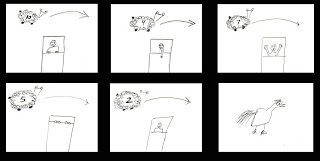
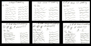 Full Storyboard PDF
The basic concept is someone who is having a really hard time getting to sleep and is counting down sheep to try and get some shut eye. I want this piece to be fun and funny- To do this I plan on having weird child-like sheep doodles, a person with really funny expresions and a suprise ending. This piece would be for a very wide audience, anyone who has ever had trouble getting to sleep could relate to it. To best express my idea the person in bed will be photographic while the sheep will be cartoony and juvenile. I want it to have sheep sound effects plus some exasperated noises :) I hope to get all the photography and illustration done the first week as putting it all together will take some time as there will be a lot of new software to learn. I want to do all the illustration and photography on my own so the only thing I need to find is sound effects. I plan on looking at children's book for inspiration in my style and drawings.

Be Careful What You Drink To...
This video would display someone getting drunker as they drink shots until they blackout without ever showing the person, but rather by looking through their eyes. I am attempting to create something that is both visually sophisticated and somewhat educational. I am also going to try to to advantage of sound effects. The audience would be teens and university students, anyone who is part of that culture of partying and doing shots. I want the audience to learn about the negative effects and dangers of alcohol. The content will include a line of shot glasses- the full shot glasses represent the number of the countdown we are on, as the shots get downed- we get closer and closer to the persons total blackout and to number one. It will all been done with photography, sound effects and light/dark and camera focus. Photography done this week so I have two weeks to work on putting the video together and output. I am also going to have to find sound effects, or record my own. I was inspired by a night out with my friends- and although beer was really the drink of choice that night- my brain works in funny ways. And no, none of us got drunk.

Ten Days Until "I do!"
The piece reflects what it is like in the ten days leading up to a girl's wedding. It is supposed to illustrate not only how busy she is, but her growing excitement for the day. I want this piece to be as minimal as possible, yet still manage to contain a lot of emotion. My intended audience is anyone who is planning a wedding or has someone close to them planning a wedding.
The content is extremely simple- just a to do list either on a girl's stationary or on a simple piece of lined paper containing a hand-written list. I would possible have some wedding related doodles on the pages as well: dresses, monograms, etc. Preparing this piece should be very simple, it really just involves writing lists and scanning them so I hope to get that done really as soon as I can so that I have as much time to learn and experiment with all the video software and after effects. The relevant sources would be all of my engaged and married friends, I am sure I can get a list of pre wedding stuff out of any of them. Concept references would probably be all the weddings I have attended recently or am currently helping friends plan.
 Full Storyboard PDF
Tuesday, January 8, 2008
World Domination Throught Design Group
I think whoever came up with that companies name may just be my new favorite person. It is either them or Mr. Rothschild their fictional cartoon client. The WDDG are masters not only of motion graphics, but of innovative thinking, and that my friends, is a winning combination.
Before talking about motion graphics, can I just say please take a look at the back end of their site. Here is a little taste of what you will find:
What the WDDG can do with Flash is amazing and all you need to do is watch their introductory video on the site to see that. The video shows off a diversity of styles but manages to keep to remain cohesive with the WDDG brand. The old school nuclear explosions manage to remain hip and fresh in the web context, especially when juxtaposed with the wacky cartoon imagery and that amazing Lego Star Wars thing.
The site itself is beautifully constructed and easy to navigate, but I wish that the user could take more control over it and maybe pause, rewind and fast forward the video. It is great to watch but, fairly long and it would have been nice to get up in the middle. It is also interesting how video and motion graphics are integrated throughout the entire site. Even the contact information, which is normally a boring static page on most sites, is done using video.
I find that often times a design companies site doesn't fully express what they are capable of as designers, and you need to check out the portfolio to really see what they were all about. I did not feel that way with the WDDG. This doesn't mean one should not check out the portfolio as it is really interesting and fun how they put it together. Plus, their work is really cool.
Check them out the World Domination Through Design Group:
http://www.wddg.com/
Before talking about motion graphics, can I just say please take a look at the back end of their site. Here is a little taste of what you will find:
ÚÄÄÄÄÄÄÄÄÄÄÄÄÄÄÄÄÄÄÄÄÄÄÄÄÄÄÄÄÄÄÄÄÄÄÄÄÄÄÄÄÄÄÄÄÄÄÄÄÄÄÄÄÄÄÄÄÄÄÄÄÄÄÄ¿
                  ________ ______
                 /_  __/ // / __/
                  / / / _  / _/
                 /_/ /_//_/___/
        ________  _______ ____________________
       / ___/ _ \/ __/ _ /_  __/ __/ __/_  __/
      / (_ / , _/ _// __ |/ / / _/_\ \  / /
      \___/_/|_/___/_/ |_/_/ /___/___/ /_/
   _____  _______________  ___  ________________   ______
  /  _/ |/ /_  __/ __/ _ \/ _ |/ ___/_  __/  _/ | / / __/
 _/ //    / / / / _// , _/ __ / /__  / / _/ / | |/ / _/
/___/_/|_/ /_/ /___/_/|_/_/ |_\___/ /_/ /___/ |___/___/
     ___  __________________  _________  ____
    / _ \/ __/ __/  _/ ___/ |/ / __/ _ \/ __/
   / // / _/_\ \_/ // (_ /    / _// , _/\ \
  /____/___/___/___/\___/_/|_/___/_/|_/___/
  ____  ____  ___   __   __     ____________  _______
 / __ \/ __/ / _ | / /  / /    /_  __/  _/  |/  / __/
/ /_/ / _/  / __ |/ /__/ /__    / / _/ // /|_/ / _/
\____/_/   /_/ |_/____/____/   /_/ /___/_/  /_/___/


ÀÄÄÄÄÄÄÄÄÄÄÄÄÄÄÄÄÄÄÄÄÄÄÄÄÄÄÄÄÄÄÄÄÄÄÄÄÄÄÄÄÄÄÄÄÄÄÄÄÄÄÄÄÄÄÄÄÄÄÄÄÄÄ¿³
Because the site was all done in Flash they had a lot of room for fun stuff amid their code and the above is just one example. Also included there is all of the designer's WOW screen names, I have started to wish I played that game....What the WDDG can do with Flash is amazing and all you need to do is watch their introductory video on the site to see that. The video shows off a diversity of styles but manages to keep to remain cohesive with the WDDG brand. The old school nuclear explosions manage to remain hip and fresh in the web context, especially when juxtaposed with the wacky cartoon imagery and that amazing Lego Star Wars thing.
The site itself is beautifully constructed and easy to navigate, but I wish that the user could take more control over it and maybe pause, rewind and fast forward the video. It is great to watch but, fairly long and it would have been nice to get up in the middle. It is also interesting how video and motion graphics are integrated throughout the entire site. Even the contact information, which is normally a boring static page on most sites, is done using video.
I find that often times a design companies site doesn't fully express what they are capable of as designers, and you need to check out the portfolio to really see what they were all about. I did not feel that way with the WDDG. This doesn't mean one should not check out the portfolio as it is really interesting and fun how they put it together. Plus, their work is really cool.
Check them out the World Domination Through Design Group:
http://www.wddg.com/
Monday, January 7, 2008
Time Based Communication
I have often thought of starting a blog, never happened. Blogging was even less successful than my attempts at keeping a journal or video diary. Truthfully I am not sure why the idea of recording the nothingness that encompasses everyday life is appealing. Maybe it is because I am not as pessimistic as the prior statement makes me seem and I always have what to say about what is going on. Well, now thanks to David Gelb and Time Based Communication I am a blogger- even if it only does last 3 months, it will still be a personal best!
Subscribe to:
Posts (Atom)