Here it is my finished Counting Leader "Alphabet Soup."
By me, Marnina Herrmann.
for Time Based Communication FA/YSDN3009M David Gelb
York Sheridan Design
Copyright 2008
Alphabet Soup, the epic meal! This soup is more than just a great tasting meal- it spells.
Using stop motion animation the alphabet noodles in the soup spell out numbers ten-two. The sound effects include the sound of stuff moving through liquid and some cool background music that emphasizes that pace at which the letters move. The music also adds this sense of epic mystery- because after all, your soup speaking to you isn't exactly an everyday occurrence.
The photography was done by placing real noodles over a photograph of soup and then by photoshopping those photographs into a photograph of a place setting. Because the noodles are so small, I decided to have the photographs cropped really closely. I also thought that it made it more visually interesting. The entire piece has a lot of layering it both the images and sound, which adds a subtle complexity to it. The fast quirky movements of the letters keep the piece from getting boring and the fact that the image zooms in at the end adds a different type of movement to the piece. I think this piece can be enjoyed by almost anyone as the sound and images are fairly sophisticated, yet the type of moment is something fun, fast and almost childlike. In addition, the content itself can appeal to a much wider audience as pretty much anyone out there whose has ever eaten alphabet soup always hopes for that one day where it will spell them some message.
Friday, January 25, 2008
Tuesday, January 22, 2008
It's Tuesday!
It's Tuesday and you know what that means! If you don't I'll tell you. A new episode of CBC's hit new show JPod.
I happen to be a huge fan of almost anything by Douglas Coupland and the book JPod was no exception. Great story, amazing characters, but what made the book even more unique was the really cool typography used throughout. The design of the book reflected the quirky story perfectly and the minute I heard it was being made into a TV show I wondered how that quirkiness would be translated into TV. Well, CBC did it and any viewers who are real Coupland fans will appreciate how the credits at the beginning of the show really communicate what he is all about. The graphics combine flat, colored squares, with photography of basic everyday stuff and type- both arbitrary letters and words. The way these three elements are layered and move create a compelling and quirky opening sequence. The whole thing has a kind of funky old school early 90's feel.
It doesn't end there though. Throughout the show at random moments they have short video sequences that match the style of the photography in the opening sequence. They really have nothing to to with anything but do have a fun charm to them, plus, they are very Coupland-esq.
These fun elements of the show are then taken and packaged into a cool little website that is remenscint of early video games- including Defendoid- the podsters favorite. Making JPod this all over amazing design experience starting with the book and it's website and now the TV show and the show's site.
Check it out on CBC.ca
After watching tonights episode I have just one complaint- at one point in the show one of the characters says how Courier is a boring font and Arial is much more interesting. I mean I am all for calling Courier boring, but Ariel interesting? COME ON!
Friday, January 18, 2008
Testing
Here is my practice run of Alphabet Soup- the timing is way off and there is no sound yet- I pretty much just wanted to see if the animation worked so I just kinda threw all my photos into iMovie. I think when I finally work out the sound and timing it'll be really nice.
May I just add- what you see above is the result of almost 300 photos- I think I will let my camera rest over the weekend.
May I just add- what you see above is the result of almost 300 photos- I think I will let my camera rest over the weekend.
Wednesday, January 16, 2008
Overcoming Motion Sickness
I guess I have always taken the convergence of film and graphic design for granted. Ever since my beginnings in graphic design I have worked with digital video, integrating it into new media projects. In addition to that, I have plans to do a masters degree in film eventually- not because I want to be a film maker, but because I like to use video's in design and feel that a film background could only make my work stronger.
While I agree with everything Michael Schmidt has to say, I do not think his article takes things far enough. He talks about how in the digital age film and graphic design are starting to merge and just look at this course to see how undeniably true that is. The thing is though in the 21st century, everything is starting to merge. While at one time graphic designers were just that, today they are expected in addition to making graphics to be computer programmers, business people, psychologists, film makers and more. Yet this is the nature of the time we live in. No one can survive by doing on one thing anymore just as mediums that only have a single application are getting less and less popular.
The truth is though, while digital video makes it easier for the two things to meld there has always been some crossover. Take for example Saul Bass and his work for Hitchcock. Even earlier than that, think back to silent film. The actors had no voice in these movies, yet thanks to typography they were still able to be heard. As I said before Schmidt is right- his vision just seems a little narrow.
Tuesday, January 15, 2008
New Idea
I have decided to ditch all my former ideas and go with something completely different. "Alphabet Soup." I plan on using alphabet soup and stop motion animation to spell out numbers on through ten. The numbers will sort of glide through the soup forming the words. The way I plan on doing this is actually photographing soup and then placing the noodles and a few vegetables on top of the photo which will be placed into a bowl. This will hopefully make the animation look fairly realistic but won't allow the letters to get lost in the soup and will make the letters easy to manipulate. The one thing I am a little stuck on at this point is what to do for sound effects- maybe some sort of boiling hiss or a spoon clinking at the second marks, Fiona also gave me the idea to use gulping or slurping noises.
Sunday, January 13, 2008
Storyboards and Creative Briefs
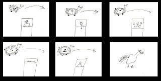
Counting Sheep
The basic concept is someone who is having a really hard time getting to sleep and is counting down sheep to try and get some shut eye. I want this piece to be fun and funny- To do this I plan on having weird child-like sheep doodles, a person with really funny expresions and a suprise ending. This piece would be for a very wide audience, anyone who has ever had trouble getting to sleep could relate to it. To best express my idea the person in bed will be photographic while the sheep will be cartoony and juvenile. I want it to have sheep sound effects plus some exasperated noises :) I hope to get all the photography and illustration done the first week as putting it all together will take some time as there will be a lot of new software to learn. I want to do all the illustration and photography on my own so the only thing I need to find is sound effects. I plan on looking at children's book for inspiration in my style and drawings.
Be Careful What You Drink To...
This video would display someone getting drunker as they drink shots until they blackout without ever showing the person, but rather by looking through their eyes. I am attempting to create something that is both visually sophisticated and somewhat educational. I am also going to try to to advantage of sound effects. The audience would be teens and university students, anyone who is part of that culture of partying and doing shots. I want the audience to learn about the negative effects and dangers of alcohol. The content will include a line of shot glasses- the full shot glasses represent the number of the countdown we are on, as the shots get downed- we get closer and closer to the persons total blackout and to number one. It will all been done with photography, sound effects and light/dark and camera focus. Photography done this week so I have two weeks to work on putting the video together and output. I am also going to have to find sound effects, or record my own. I was inspired by a night out with my friends- and although beer was really the drink of choice that night- my brain works in funny ways. And no, none of us got drunk.

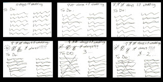
Ten Days Until "I do!"
The piece reflects what it is like in the ten days leading up to a girl's wedding. It is supposed to illustrate not only how busy she is, but her growing excitement for the day. I want this piece to be as minimal as possible, yet still manage to contain a lot of emotion. My intended audience is anyone who is planning a wedding or has someone close to them planning a wedding.
The content is extremely simple- just a to do list either on a girl's stationary or on a simple piece of lined paper containing a hand-written list. I would possible have some wedding related doodles on the pages as well: dresses, monograms, etc. Preparing this piece should be very simple, it really just involves writing lists and scanning them so I hope to get that done really as soon as I can so that I have as much time to learn and experiment with all the video software and after effects. The relevant sources would be all of my engaged and married friends, I am sure I can get a list of pre wedding stuff out of any of them. Concept references would probably be all the weddings I have attended recently or am currently helping friends plan.
 Full Storyboard PDF
The basic concept is someone who is having a really hard time getting to sleep and is counting down sheep to try and get some shut eye. I want this piece to be fun and funny- To do this I plan on having weird child-like sheep doodles, a person with really funny expresions and a suprise ending. This piece would be for a very wide audience, anyone who has ever had trouble getting to sleep could relate to it. To best express my idea the person in bed will be photographic while the sheep will be cartoony and juvenile. I want it to have sheep sound effects plus some exasperated noises :) I hope to get all the photography and illustration done the first week as putting it all together will take some time as there will be a lot of new software to learn. I want to do all the illustration and photography on my own so the only thing I need to find is sound effects. I plan on looking at children's book for inspiration in my style and drawings.

Be Careful What You Drink To...
This video would display someone getting drunker as they drink shots until they blackout without ever showing the person, but rather by looking through their eyes. I am attempting to create something that is both visually sophisticated and somewhat educational. I am also going to try to to advantage of sound effects. The audience would be teens and university students, anyone who is part of that culture of partying and doing shots. I want the audience to learn about the negative effects and dangers of alcohol. The content will include a line of shot glasses- the full shot glasses represent the number of the countdown we are on, as the shots get downed- we get closer and closer to the persons total blackout and to number one. It will all been done with photography, sound effects and light/dark and camera focus. Photography done this week so I have two weeks to work on putting the video together and output. I am also going to have to find sound effects, or record my own. I was inspired by a night out with my friends- and although beer was really the drink of choice that night- my brain works in funny ways. And no, none of us got drunk.

Ten Days Until "I do!"
The piece reflects what it is like in the ten days leading up to a girl's wedding. It is supposed to illustrate not only how busy she is, but her growing excitement for the day. I want this piece to be as minimal as possible, yet still manage to contain a lot of emotion. My intended audience is anyone who is planning a wedding or has someone close to them planning a wedding.
The content is extremely simple- just a to do list either on a girl's stationary or on a simple piece of lined paper containing a hand-written list. I would possible have some wedding related doodles on the pages as well: dresses, monograms, etc. Preparing this piece should be very simple, it really just involves writing lists and scanning them so I hope to get that done really as soon as I can so that I have as much time to learn and experiment with all the video software and after effects. The relevant sources would be all of my engaged and married friends, I am sure I can get a list of pre wedding stuff out of any of them. Concept references would probably be all the weddings I have attended recently or am currently helping friends plan.
 Full Storyboard PDF
Tuesday, January 8, 2008
World Domination Throught Design Group
I think whoever came up with that companies name may just be my new favorite person. It is either them or Mr. Rothschild their fictional cartoon client. The WDDG are masters not only of motion graphics, but of innovative thinking, and that my friends, is a winning combination.
Before talking about motion graphics, can I just say please take a look at the back end of their site. Here is a little taste of what you will find:
What the WDDG can do with Flash is amazing and all you need to do is watch their introductory video on the site to see that. The video shows off a diversity of styles but manages to keep to remain cohesive with the WDDG brand. The old school nuclear explosions manage to remain hip and fresh in the web context, especially when juxtaposed with the wacky cartoon imagery and that amazing Lego Star Wars thing.
The site itself is beautifully constructed and easy to navigate, but I wish that the user could take more control over it and maybe pause, rewind and fast forward the video. It is great to watch but, fairly long and it would have been nice to get up in the middle. It is also interesting how video and motion graphics are integrated throughout the entire site. Even the contact information, which is normally a boring static page on most sites, is done using video.
I find that often times a design companies site doesn't fully express what they are capable of as designers, and you need to check out the portfolio to really see what they were all about. I did not feel that way with the WDDG. This doesn't mean one should not check out the portfolio as it is really interesting and fun how they put it together. Plus, their work is really cool.
Check them out the World Domination Through Design Group:
http://www.wddg.com/
Before talking about motion graphics, can I just say please take a look at the back end of their site. Here is a little taste of what you will find:
ÚÄÄÄÄÄÄÄÄÄÄÄÄÄÄÄÄÄÄÄÄÄÄÄÄÄÄÄÄÄÄÄÄÄÄÄÄÄÄÄÄÄÄÄÄÄÄÄÄÄÄÄÄÄÄÄÄÄÄÄÄÄÄÄ¿
                  ________ ______
                 /_  __/ // / __/
                  / / / _  / _/
                 /_/ /_//_/___/
        ________  _______ ____________________
       / ___/ _ \/ __/ _ /_  __/ __/ __/_  __/
      / (_ / , _/ _// __ |/ / / _/_\ \  / /
      \___/_/|_/___/_/ |_/_/ /___/___/ /_/
   _____  _______________  ___  ________________   ______
  /  _/ |/ /_  __/ __/ _ \/ _ |/ ___/_  __/  _/ | / / __/
 _/ //    / / / / _// , _/ __ / /__  / / _/ / | |/ / _/
/___/_/|_/ /_/ /___/_/|_/_/ |_\___/ /_/ /___/ |___/___/
     ___  __________________  _________  ____
    / _ \/ __/ __/  _/ ___/ |/ / __/ _ \/ __/
   / // / _/_\ \_/ // (_ /    / _// , _/\ \
  /____/___/___/___/\___/_/|_/___/_/|_/___/
  ____  ____  ___   __   __     ____________  _______
 / __ \/ __/ / _ | / /  / /    /_  __/  _/  |/  / __/
/ /_/ / _/  / __ |/ /__/ /__    / / _/ // /|_/ / _/
\____/_/   /_/ |_/____/____/   /_/ /___/_/  /_/___/


ÀÄÄÄÄÄÄÄÄÄÄÄÄÄÄÄÄÄÄÄÄÄÄÄÄÄÄÄÄÄÄÄÄÄÄÄÄÄÄÄÄÄÄÄÄÄÄÄÄÄÄÄÄÄÄÄÄÄÄÄÄÄÄ¿³
Because the site was all done in Flash they had a lot of room for fun stuff amid their code and the above is just one example. Also included there is all of the designer's WOW screen names, I have started to wish I played that game....What the WDDG can do with Flash is amazing and all you need to do is watch their introductory video on the site to see that. The video shows off a diversity of styles but manages to keep to remain cohesive with the WDDG brand. The old school nuclear explosions manage to remain hip and fresh in the web context, especially when juxtaposed with the wacky cartoon imagery and that amazing Lego Star Wars thing.
The site itself is beautifully constructed and easy to navigate, but I wish that the user could take more control over it and maybe pause, rewind and fast forward the video. It is great to watch but, fairly long and it would have been nice to get up in the middle. It is also interesting how video and motion graphics are integrated throughout the entire site. Even the contact information, which is normally a boring static page on most sites, is done using video.
I find that often times a design companies site doesn't fully express what they are capable of as designers, and you need to check out the portfolio to really see what they were all about. I did not feel that way with the WDDG. This doesn't mean one should not check out the portfolio as it is really interesting and fun how they put it together. Plus, their work is really cool.
Check them out the World Domination Through Design Group:
http://www.wddg.com/
Monday, January 7, 2008
Time Based Communication
I have often thought of starting a blog, never happened. Blogging was even less successful than my attempts at keeping a journal or video diary. Truthfully I am not sure why the idea of recording the nothingness that encompasses everyday life is appealing. Maybe it is because I am not as pessimistic as the prior statement makes me seem and I always have what to say about what is going on. Well, now thanks to David Gelb and Time Based Communication I am a blogger- even if it only does last 3 months, it will still be a personal best!
Subscribe to:
Posts (Atom)