I am thinking of putting some German quotes from the original story in the table of contents. This would be to:
a) provide contrast to the titles of the stories which will be in English in the TOC,
b) a way to infuse some of the original text into the book and,
c) an excuse to use text-sized blackletter.
I also plan on having the title of the story in the same color I use on that stories spread. Maybe with a black background and the quotes in the brown...
Friday, February 27, 2009
Friday, February 20, 2009
Color
After class today I began experimenting with color like every suggested. I decided to go bold rather than subtle. I quite like the results but and not sure if I am 100% so I figured I would upload a few spreads to see what people think.
Comments? Criticism?


If I do end up going this route I would use only those four colors and I would incorporate them into the table of contents and the rest of the prelims and end matter. I am still unsure about the cover.
Another debate I am having is what to do about page numbers. I think I would like to have them on the text pages but I am not sure... Another idea is to print them on the border of the picture pages. I could leave them out all together but then I am not sure what I would do with my table of contents. I am also not positive about the borders. I think they are needed though for separation between pages.
I also have one specific question. In the final spread the two hands are arranged as a mirror image. Should I flip the second hand, or do we like the mirror image?
(I will be updating the answers to the five questions I just wanted to get some ideas out there right away.)
Thursday, February 19, 2009
Pleasures and Frustrations
I am a book junkie and I come from a family of book junkies. Our house is literally covered in books. That being said there is no way I could have not loved a course in book design. On the other hand, I do think one can enjoy this course even if they don't have a passion for books.
First and foremost book design provides one with an amazing finished product. A whole book! Made just by you!
Additionally designing a book takes a lot more long-term thinking than simply designing a poster. On a similar note, it gives you practice doing creative direction. When you have let's say 50 pages that need to be cohesive yet remain interesting all the way through, that is a challenge.
If you have no focus I wouldn't necessarily recommend book design to you. It takes a lot more stick-to-it-ness than designing a logo.
Another element of book design is the actual building on the book. If you have a fear of working off of the computer you may enjoy designing the book, but I would say look for a course that does not involve building your own book. For those of you who do like to get hands-on book design is a great place you can combine graphic design with 3D design. In addition to simply building the book, you can have a lot of fun exploring different book binding materials. Plus you can even get a little messy with all the paste and glue involved!
Compromises
If time or money was not an issue I really would have changed very little.
I would probably want to produce a second larger copy of the book. Maybe a foot and a half by a foot and a half. While I knew I wanted a small square book from the very beginning, now that I see the project taking shape I think it would be interesting to see it in large as well. Unfortunately I am not sure how the photos would look at that size and printing cost would be insane.
As well I would have loved to have it professionally bound and have the cloth embossed or foil-stamped. Although, the more I think about it the more I like the idea of binding it myself. It is such a deeply personal project it almost seems like a cop out to get someone else to bind it.
I guess the last thing I had to compromise on was the blackletter font I used. I would have loved to find the exact font in the copy of the original book I have at home.
I have been working on this project since September, 6 months, and am still really happy with how it is taking shape. That really says a lot for the project. Normally I get bored with projects really fast.
Making Choices
Font Choices
Immediately when I decided on my project direction I knew I had to use blackletter. I completely adore it and would love to use it all day everyday, it just isn't practical. While this is my big opportunity to finally take advantage of this beautiful form of writing I had to choose the perfect typeface. After looking at almost every version of blackletter under the sun and still not coming up with a decision, I decided to stay true to the original book and use the font from the cover. The problem was, even after looking through about 350 different versions of blackletter I couldn't find that exact one! The closest I found was Lichte Weiss-Fraktur. Truthfully it was almost an exact match. The issue with that was while I saw the font printed in a book (Fraktur Mon Amour) I couldn't find anywhere I could download it (for free or money). The closest I found was Weiss-Fraktur. The letter shapes are the same, the difference is the Lichte version is one of the two-toned fonts.
I knew right away that for readability sake I would have to throw in some non-blackletter as well. Even the original only uses blackletter on the cover. I decided I would make all German in blackletter and all English in a sans-serif. I figured that once I was using the same blackletter font the original used, I would use the same sans serif as well. Hence, my decision to use Futura. As Futura was designed in the 1920's I am pretty sure my book is not a first edition...
Photography Choices
I always knew my photographs needed to have a really creepy but still modern feel. This wasn't to hard to achieve with the macabre content and modern props and scenery. The hard part was choosing a color scheme that married modernity with old school fear. I think the sepia manages to do that quite well.
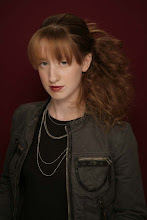
Another choice I had to make was how to go about producing these photos. Originally I had intended on shooting other people but I really didn't want to bother with a model release. I could have other people photograph me, but I wanted the photos to be mine. In the end I got out my tripod and photographed myself! What started off as simply a convenience ended up as a new direction for my whole project. I am really happy with the results. As this project was very personal to begin with I liked how I was able to take that aspect to the max. It is also just really cool to have a piece that you were involved in in such a complete way.
This spread is characteristic of my typography and photography choices throughout the book:

The Evolution of the Project
The project has not evolved all that much. I started off with a really strong idea of what I wanted to do and have pretty much followed through on that. Truthfully looking through my half a million blog posts will probably give one a better idea of this project's evolution than a single post, but I will do my best to summarize.
The Evolution of the Concept:
Originally I had planned on doing simply a modernized version of the original. I was going to simply rewrite the stories in modern English and juxtapose them with illustrative photos. I then had ideas about fragmented poetry in English and German. Which led me to the idea of using no body copy, simply titles. Eventually, once I started using myself as a model in the photos I decided to personalize the book even more and write myself into the stories.
The Evolution of the Visuals:
The color scheme went through quite a few changes. From black and white, to black, white and red. Then to various shades of blue. Then I went with Sepia. Finally, I added some color to compliment the sepia.
The photos never went through any physical evolution (except color-wise). The minute I started to work on them they came together really nicely. Originally though I had some other ideas for how to do them. I had considered making photos extremely cropped and abstract. I had thought of showing only hands in all my photos. I had also considered using other people as models. As I mentioned before, I am really happy with the direction I ended up taking.
The layout is still undergoing change. I have played around with many different types of layouts and am not positive of the final design. I have made one decision though. Originally I had wanted to have all text pages laid out the same way. I have since decided to treat each page differently according to length of text, whether they are a verso or recto page, and what photo they are juxtaposed with. What will not change is fonts.
Check out the evolution:


A Character Sketch of the Book
My book is a modern day version of Heinrich Hoffman's 1845 hit book "Der Stuwwelpeter." The book is basically a series of gruesome cautionary tales for children. I along with generations of children with Germany ancestry grew up hearing these tales, and while I never believed them, they were definitely an interesting part of my childhood.Rather than simply take the book and update the design for 2009 I decided to put a personal spin on the stories as well, hence the title Der Struwwelherrmann. Unlike the original I decided to use photography to illustrate the stories. Rather than find myself models, the photos are a series of self portraits (don't know what I would do without a tripod). To compliment the photos I rewrote the stories as if they had come true in my real life and in my dreams. It is all very weird and twisted, but it gives an new perspective on an old story. It will be interesting to see if people who are familiar with the original interpret it differently than people who are not.
The book is organized very similarly to the original. Each story can act as a stand alone section of the book. Unlike the original book I have included an introduction and conclusion. These set the stage for my personal twist on the story. The intro and conclusion also give one the option to read through the book as a single cohesive narrative rather than just as a bunch of short stories.
Visually the book is an eclectic mix of old and new. It is a small square book which I plan as binding as a hardcover book with glossy dust jacket. I used colors eyedropped from the cover and sepia as my color scheme. The colors add a childish feeling while the sepia adds an old fashioned feel to the very modern photographs. The type also blends old and new. Everything written in German will be in Weiss-Fraktur a blackletter font very similar to the on featured on the cover of the original book, while the English will be in Futura, the font that is used for the text inside the book. Each text page will have a slightly different layout. This is for two reasons. The first being to compensate for vary text lengths. The second reason is to add visual interest. Most pages are just fully bled photos and so I would like to take advantage of the pages that are not. Below are two sample spreads. The first is an example of a spread with text while the second is a spread without.


Sunday, February 8, 2009
A Thought
My book is pretty much a series of photographs of myself. This means those who see the book and know me will interpret it very differently than those who see it and don't. So I am wondering if I should put and about the author in the back with a photo of myself, or something that explains the project, or should I let the project operate on two levels?
Subscribe to:
Posts (Atom)